WellWay: A Modular Health App
This app design grew out of my personal struggles with managing multiple health conditions. Tracking everything effectively required using a large number of health apps, each focused on a single condition. This often meant entering the same information—such as food tracking—across multiple platforms. These challenges led to the design of a customizable, module-based app that allows users to choose what they want to track while keeping all health data in one centralized place. The goal of the app is not only to track symptoms, but also to store detailed logs that help identify patterns over time.
This app was created using Figma. Click here to see the working prototype
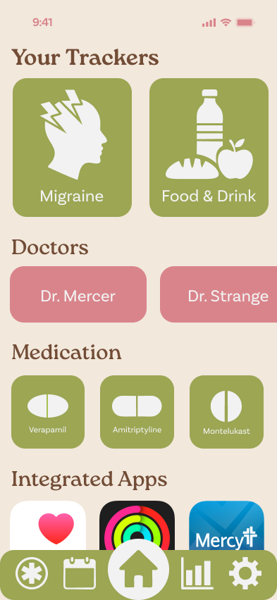
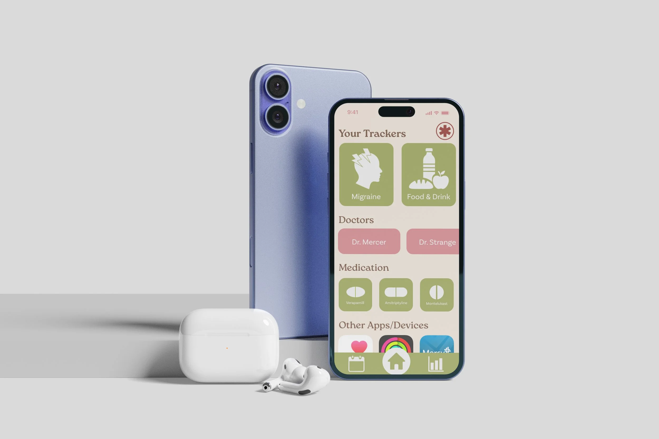
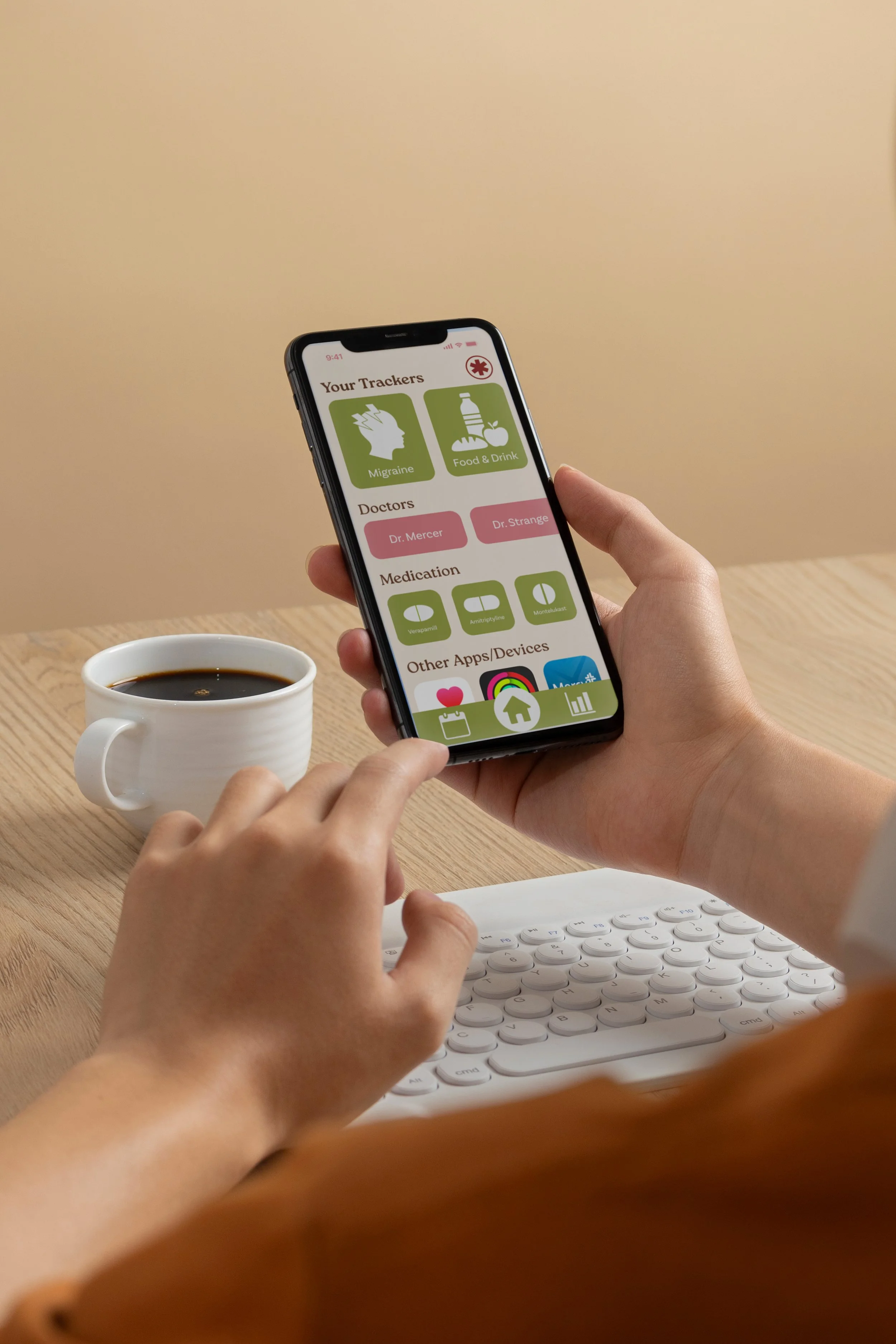
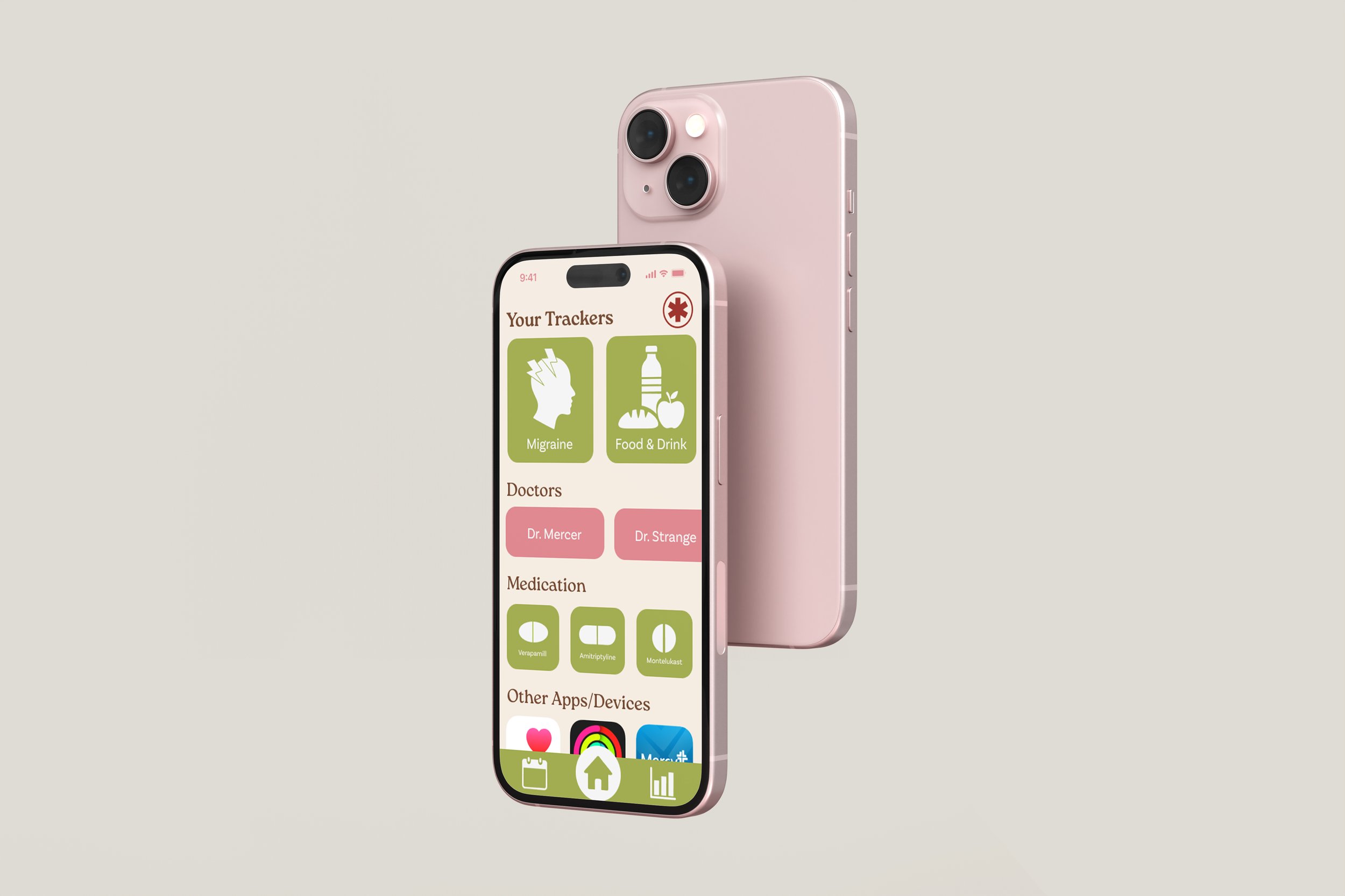
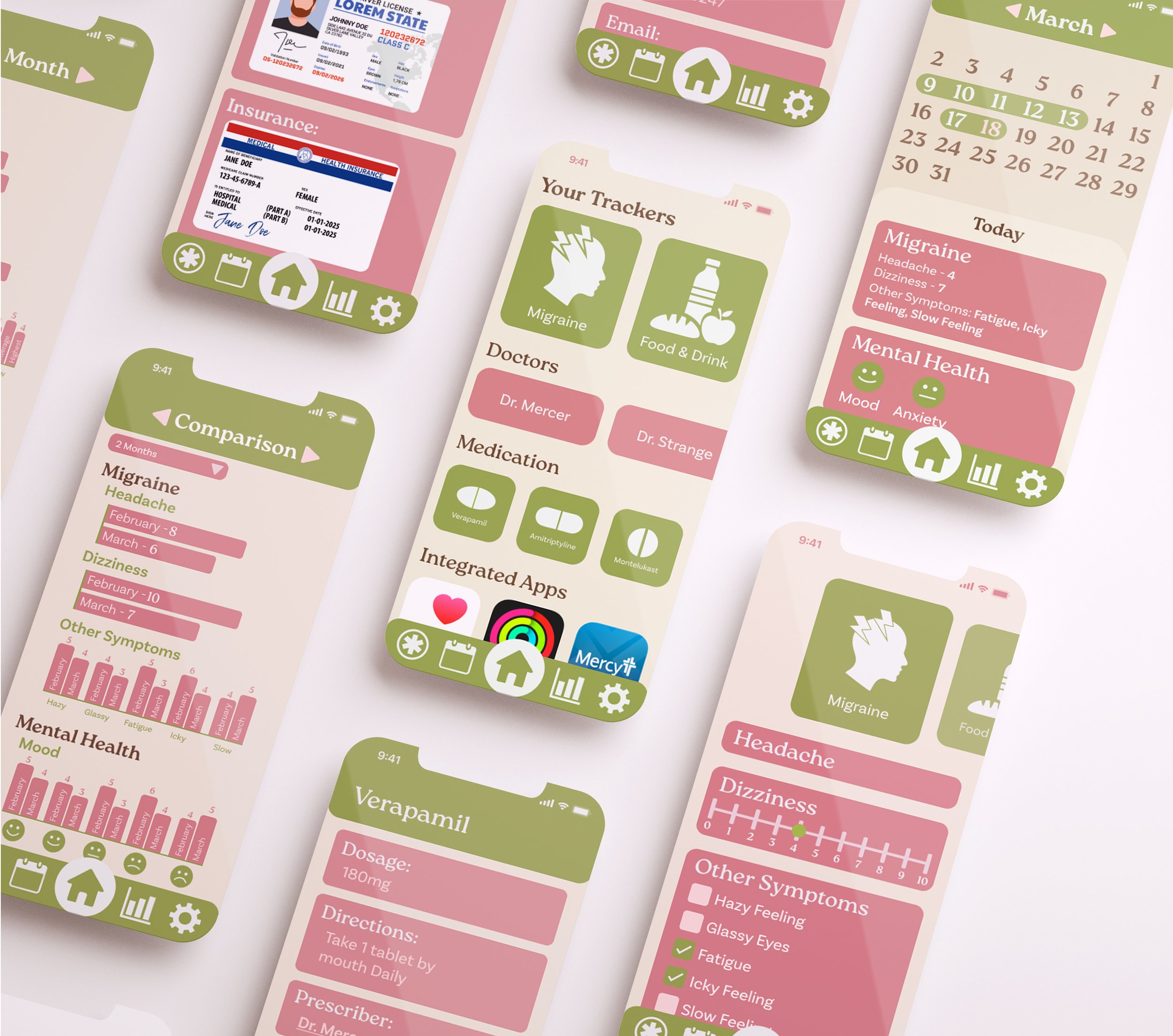
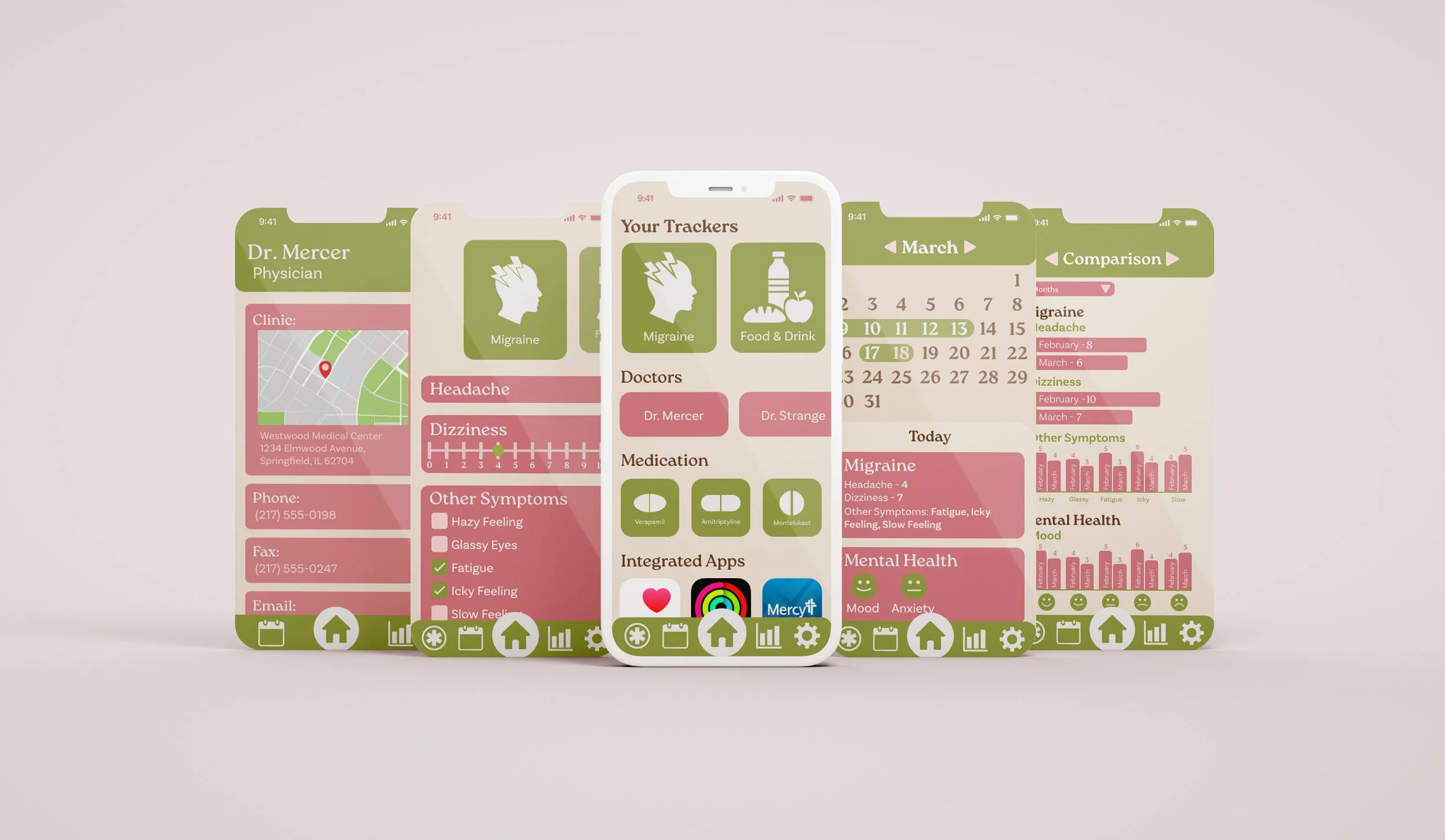
The homepage is designed to show the most important information as soon as the user enters the app, with trackers placed at the top of the screen since they are the main function of the app. Additional sections follow, including doctor details, medications, and connected health apps on the user’s phone. A navigation bar at the bottom allows users to move easily between core sections of the app, including the emergency page, monthly view, analysis section, and settings, while a dedicated homepage button makes it easy to return to the main dashboard at any time.
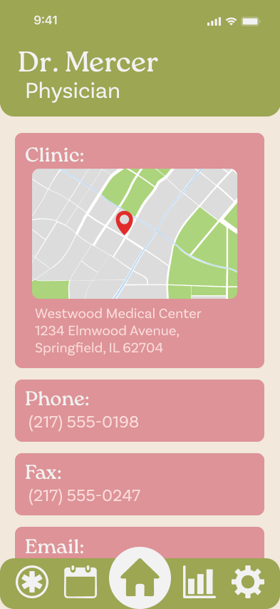
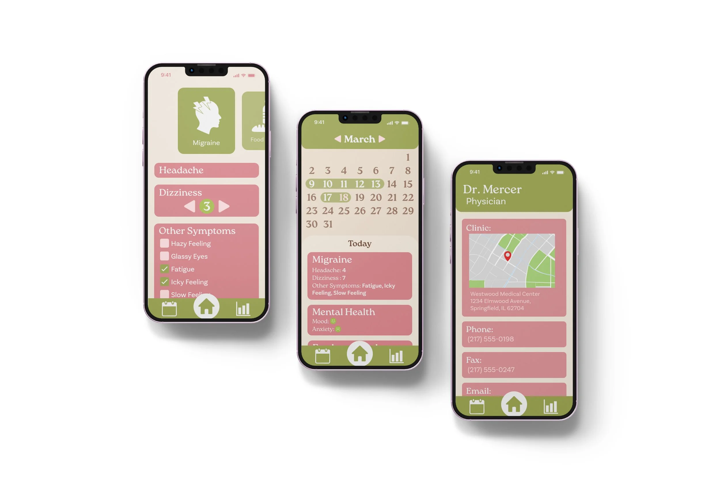
The doctor information section contains everything you need for quick reference, including your doctor’s name, location, email, and details about past and
upcoming appointments (not pictured here). This ensures all essential medical contacts and appointment history are easily accessible in one place.
Doctors
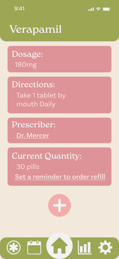
Medication
The medication information section
includes important details such as
dosage and frequency, making it easier
to complete medical paperwork. It also provides a direct link to the prescribing doctor for quick reference, along with the option to set refill reminders to help
ensure doses are not missed.
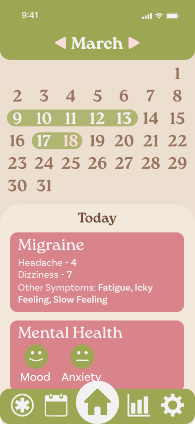
The calendar features dropdown sections that correspond to individual trackers. Selecting a section allows users to quickly view all entries made for that day in a clear, organized format, making it easier to identify patterns and review past information at a glance.
Calendar
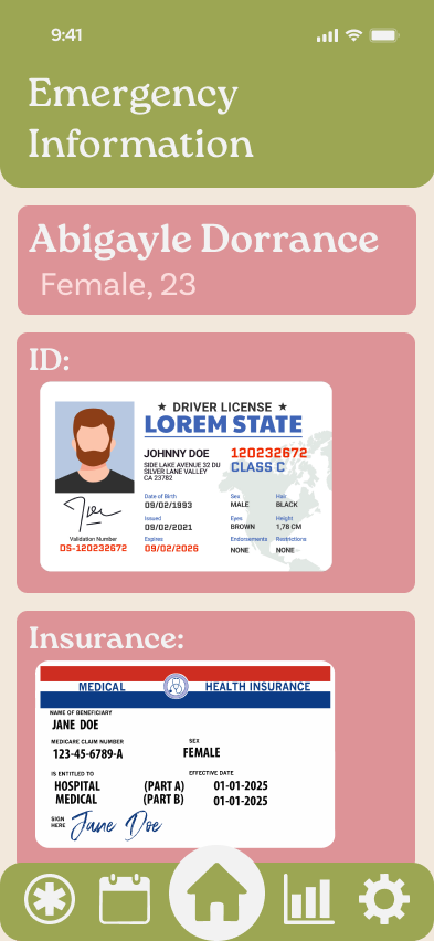
Emergency Information Page
The emergency information section is designed for situations where the user is unconscious or unable to communicate with medical professionals. Selecting the emergency symbol in the navigation bar immediately directs users to this page, which contains essential emergency details for quick and easy access.
Tracker Progression
Step 1
The trackers start as a blank page, allowing users to a pop-up appears prompting customize their experience by adding only the trackers they need.
Step 2
When clicking the plus button, a pop-up appears prompting the user to choose a tracker to add. Each tracker is added individually, and users can either input data immediately or wait to fill them
out later.
Step 3-4
Tapping on a tracker reveals a pull-down menu that allows for quick and easy data entry. To the right, two tracker types are shown: one for dizziness and another for general symptoms.
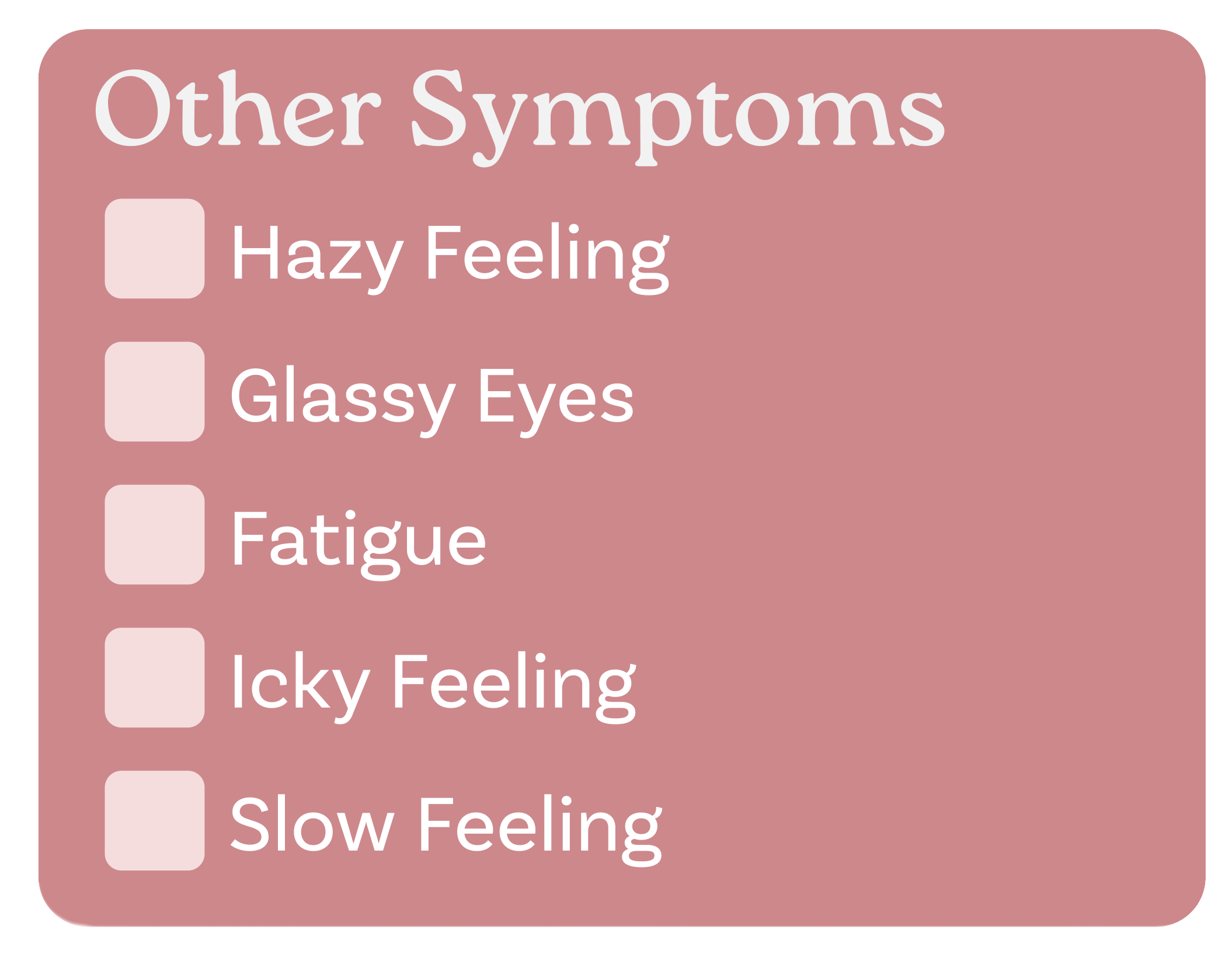
Checkboxes are used for individual items that need to be tracked but do not require measurement. Instead of using text entry, checkboxes provide a more intuitive and efficient way to record this type of information.
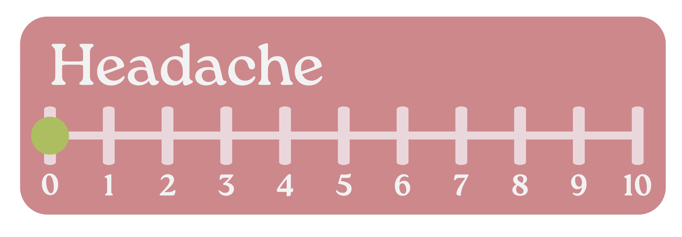
A 0–10 scale is a common method used in doctors’ offices to ask patients to rate their pain. Because it is a standard tool, tracking pain in this way can help make doctor visits easier and more effective.
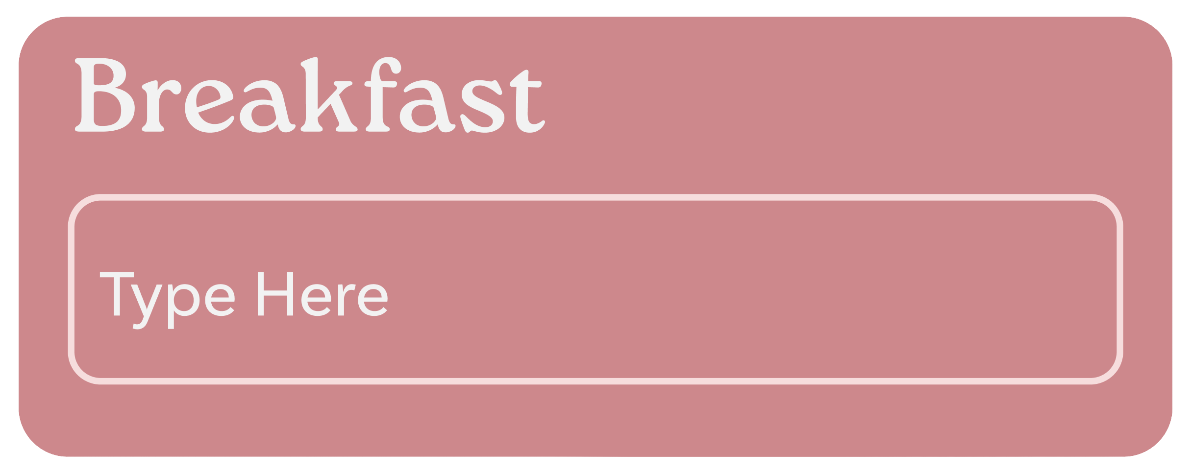

This is a simple text entry box used for cases such as recording what you ate, writing journal entries, or using words to describe the pain you are in.
The liquid tracker was designed to track the number of cups of water (or other liquids) consumed throughout the day.
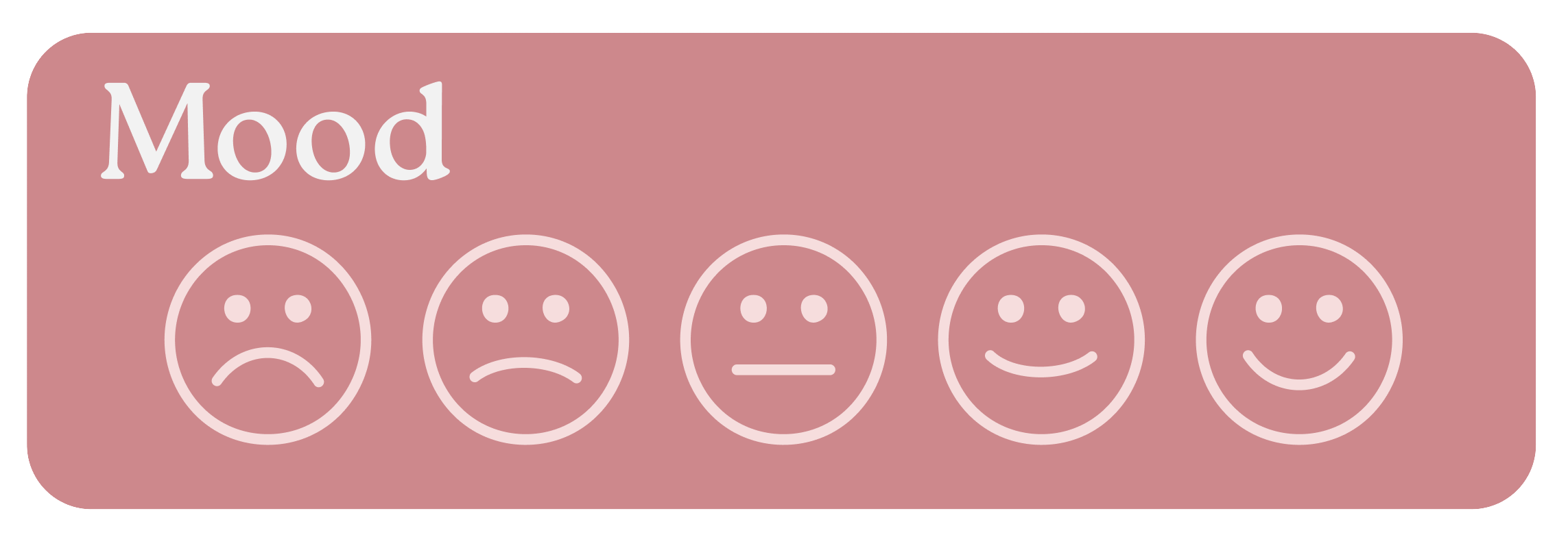
Emotion faces are useful not only for tracking mental health, but also as a simpler way to record pain levels for users who prefer not to use a numerical scale from 0 to 10.
Data Analysis
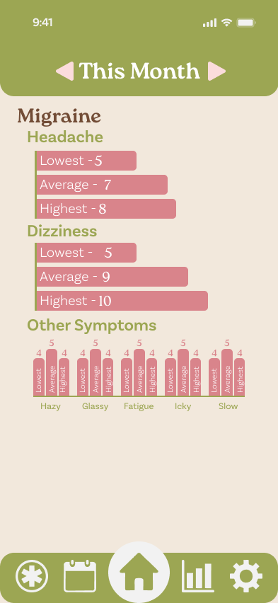
This Month
The goal of this page is to compare data tracked throughout the current month. It allows users to easily view the lowest entry, highest entry, and monthly average, helping them identify patterns and consider adjustments based on what their body is communicating.
Comparison 2 Months
This page allows users to compare the current month to the previous one, making it easier to see whether their health is stable, improving, or worsening. It also helps users understand whether changes made between months have had a noticeable impact on their current health.
Patterns
This page is simply to see what patterns have been observed throughout your entries. This allows you to easily see correlations between different trackers to see how you might need to adjust your life.
Comparison 6 Months
This is to better compare your health for longer terms of times allowing you to better see how your health is looking long term. This is great for showing doctors to show what has happened since their last appointment if it has been a long time.