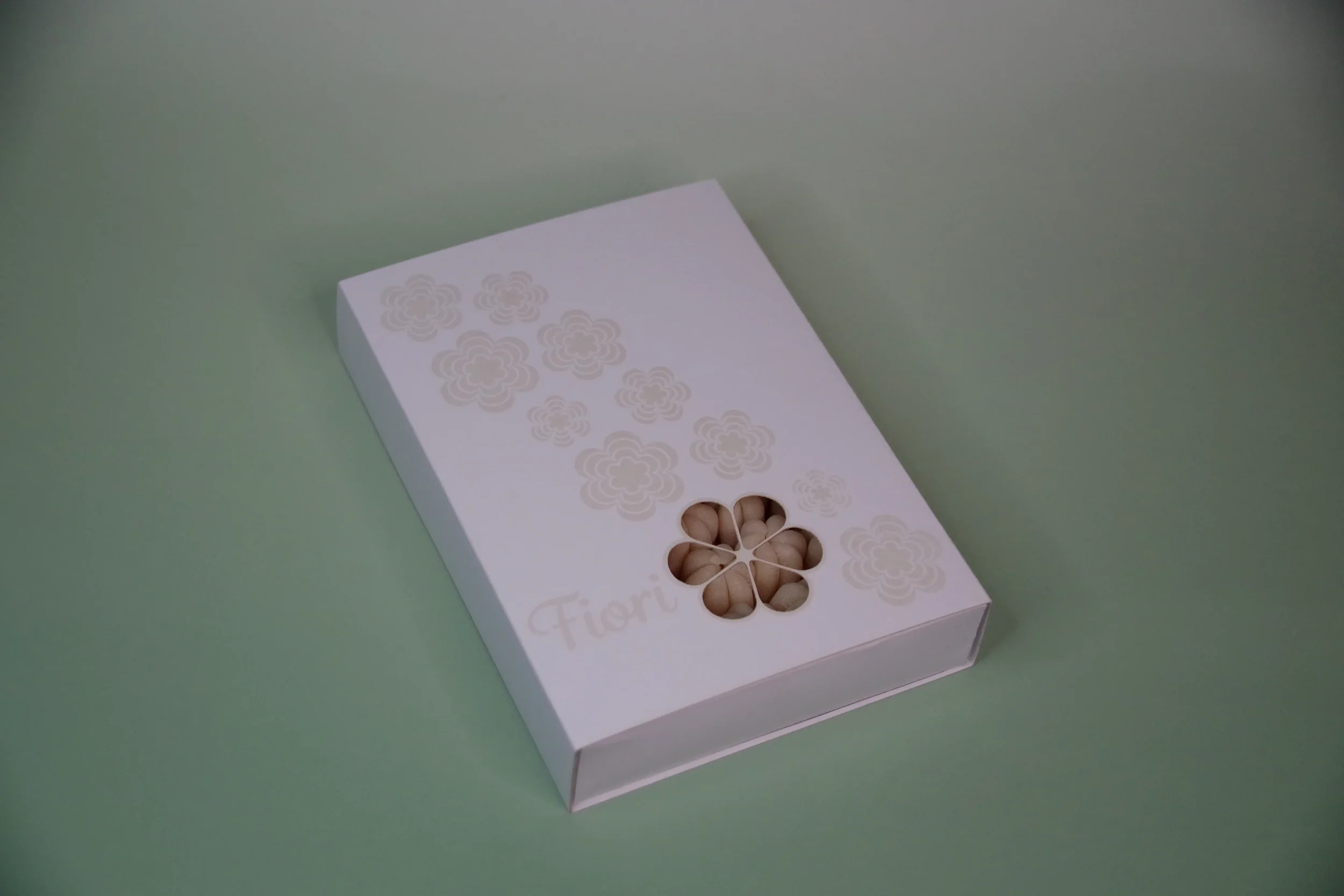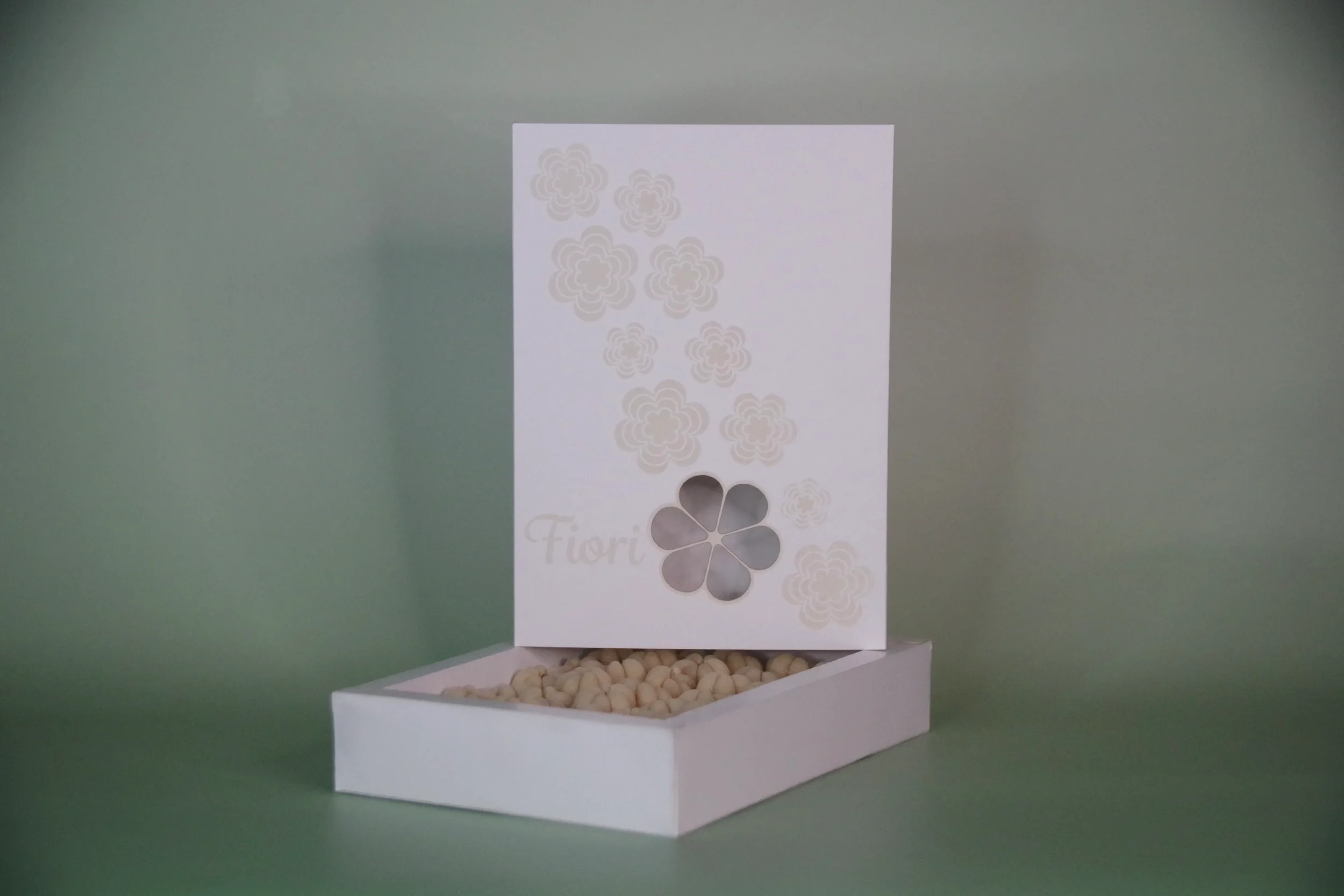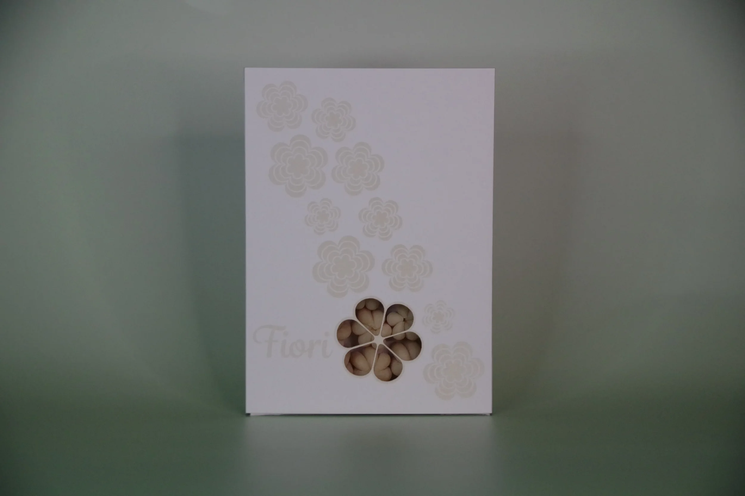
Fiori Pasta Packaging
While designing this packaging, we were challenged to use only two colors. To achieve this, we utilized our campus laser cutter, specifically its engraving feature, to create the secondary color. This approach allowed us to explore new technology and better understand how to integrate it into our design process.
I chose to design packaging for a pasta called Fiori, named for its flower-like shape. Inspired by this, I created a cascading floral arrangement that flows diagonally across the packaging, aiming to evoke a sense of elegance and luxury. I used a script-style typeface for the pasta name, complementing the delicate floral design. I also integrated one of the flower shapes as a die-cut window, allowing the pasta to be visible from the outside.